
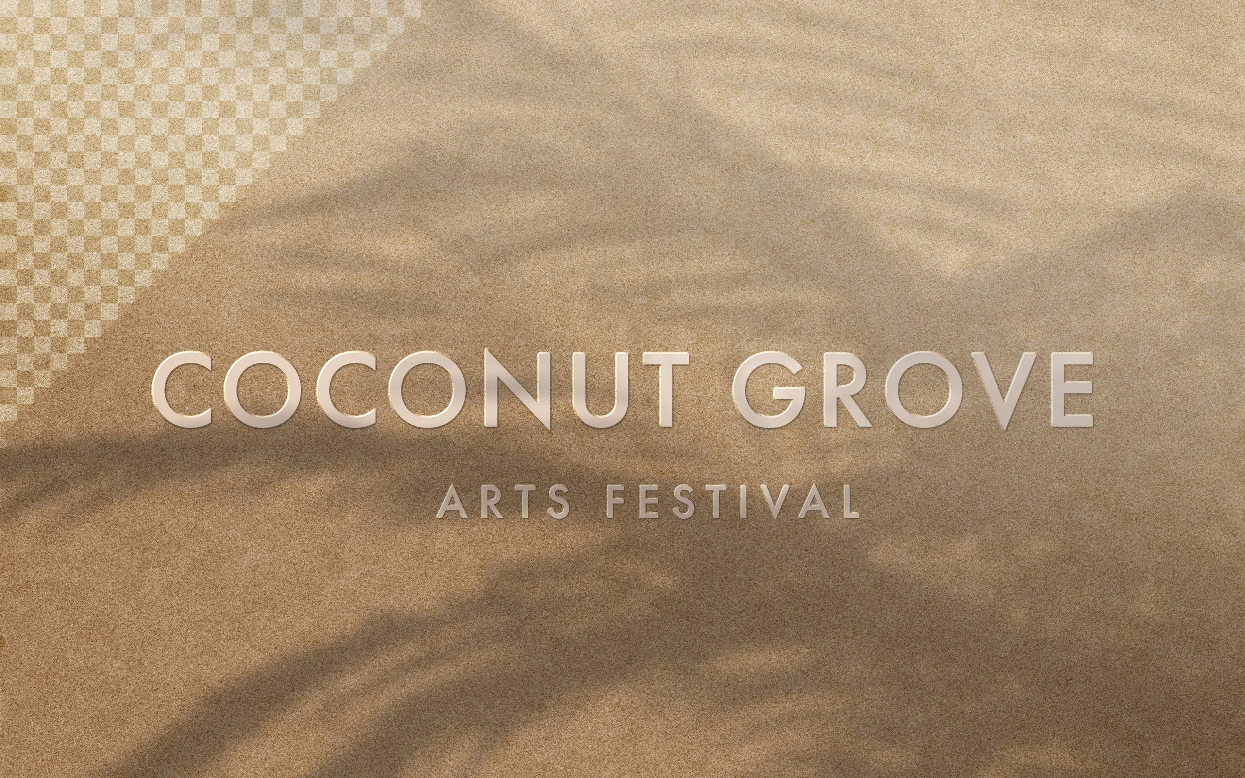
Now that Miami has become a hub for all things design and has many events year round, this particular festival is in need of a rebranding to keep to date with the competitive arts scene. Its visual identity communicates something flashy that is not representational of the location or the people .
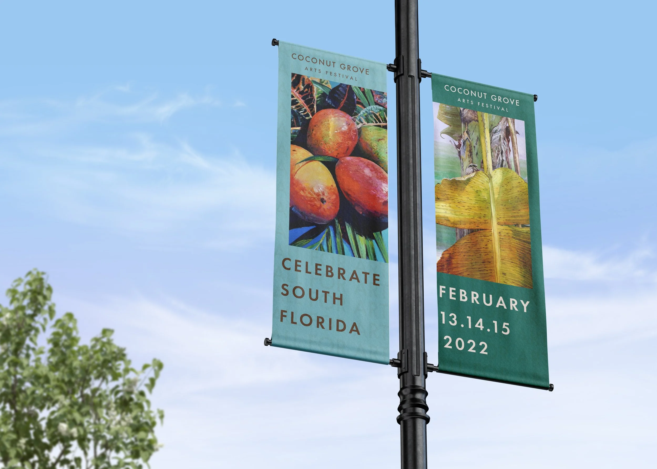
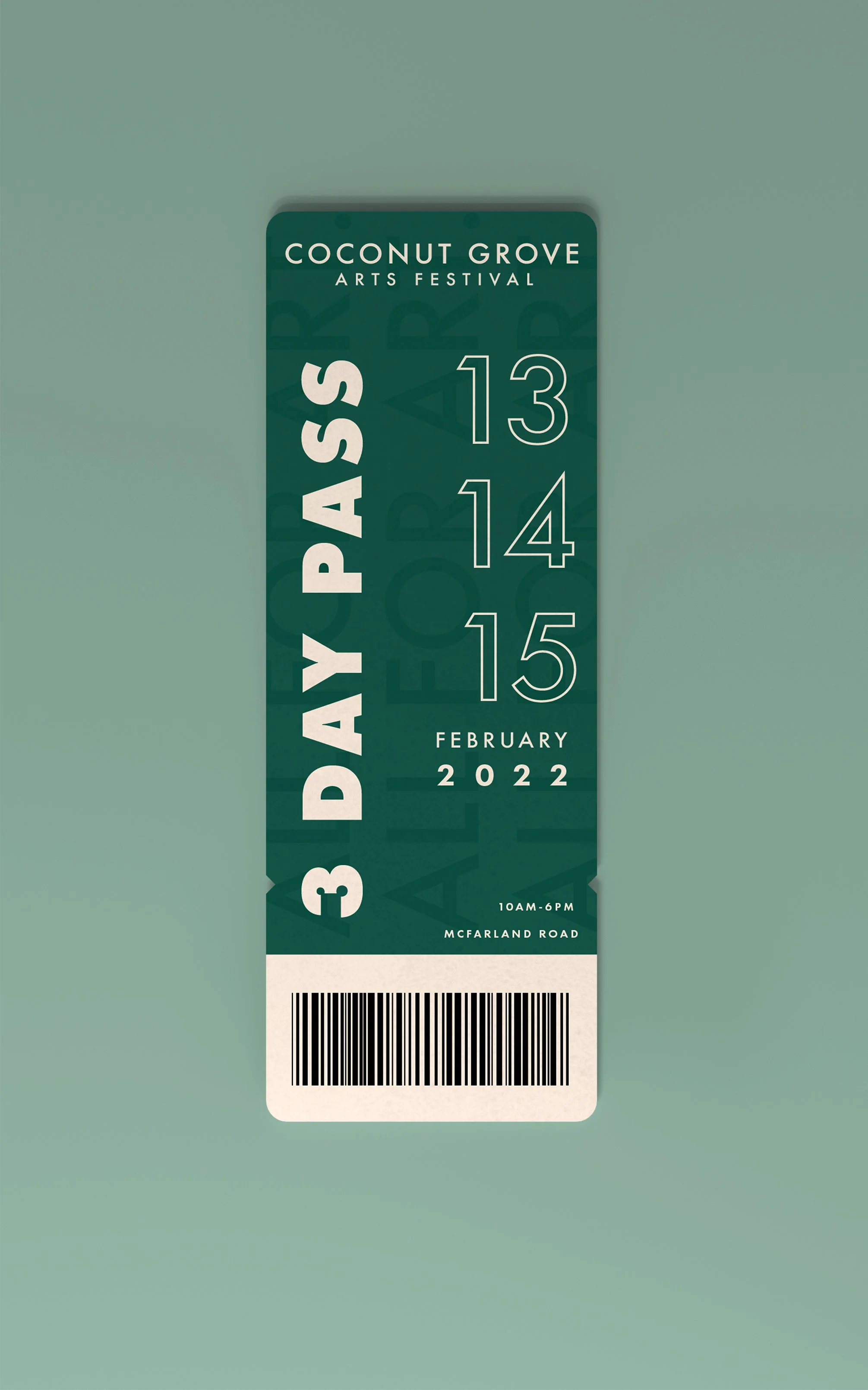
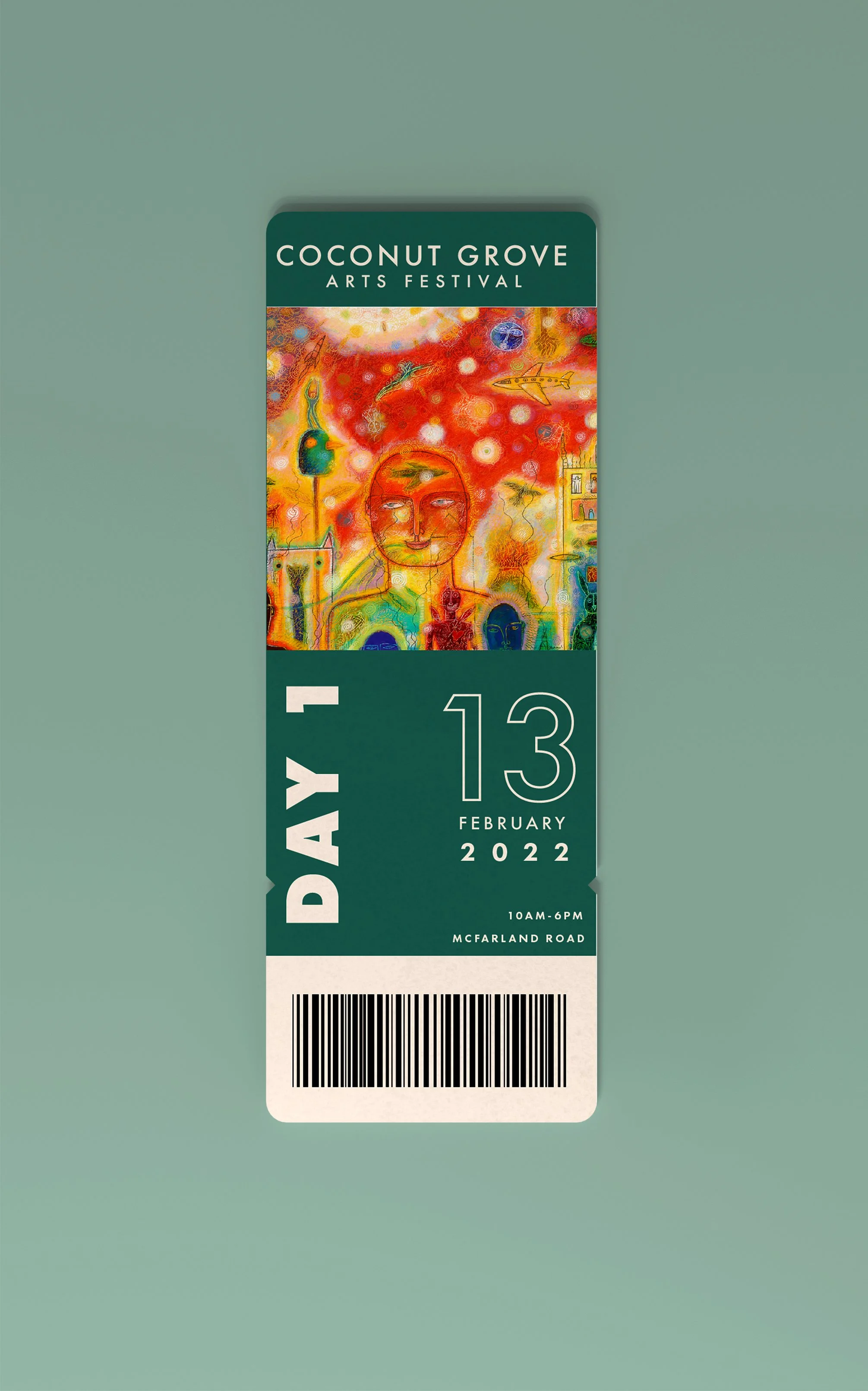
I decided to do a rebranding of it’s identity so that it focuses mainly on the history and nature of the location by creating a visual identity brandmark that would be used for all there platforms as well as designing visuals that mainly have artworks by local arts in them to give them visibility.
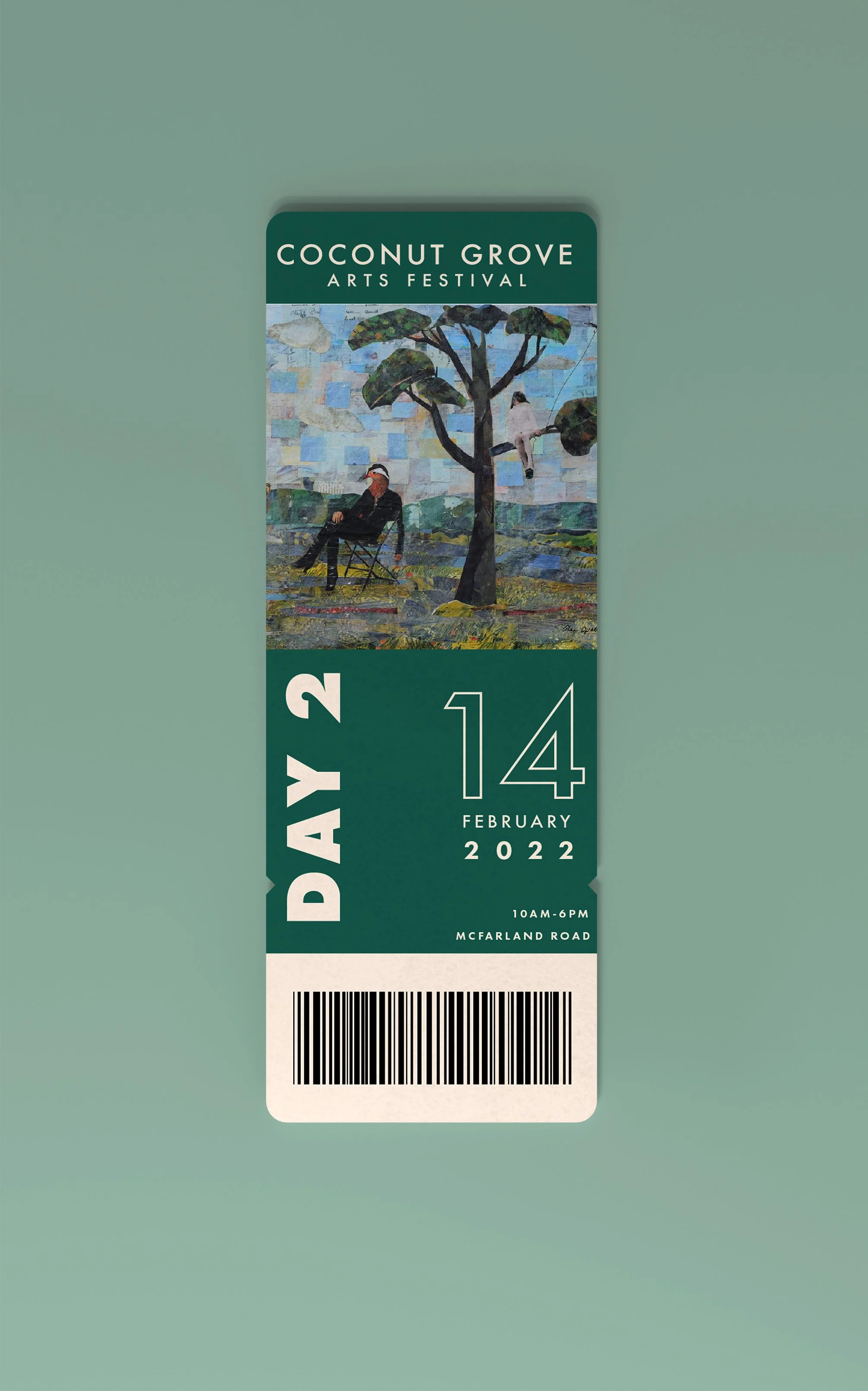
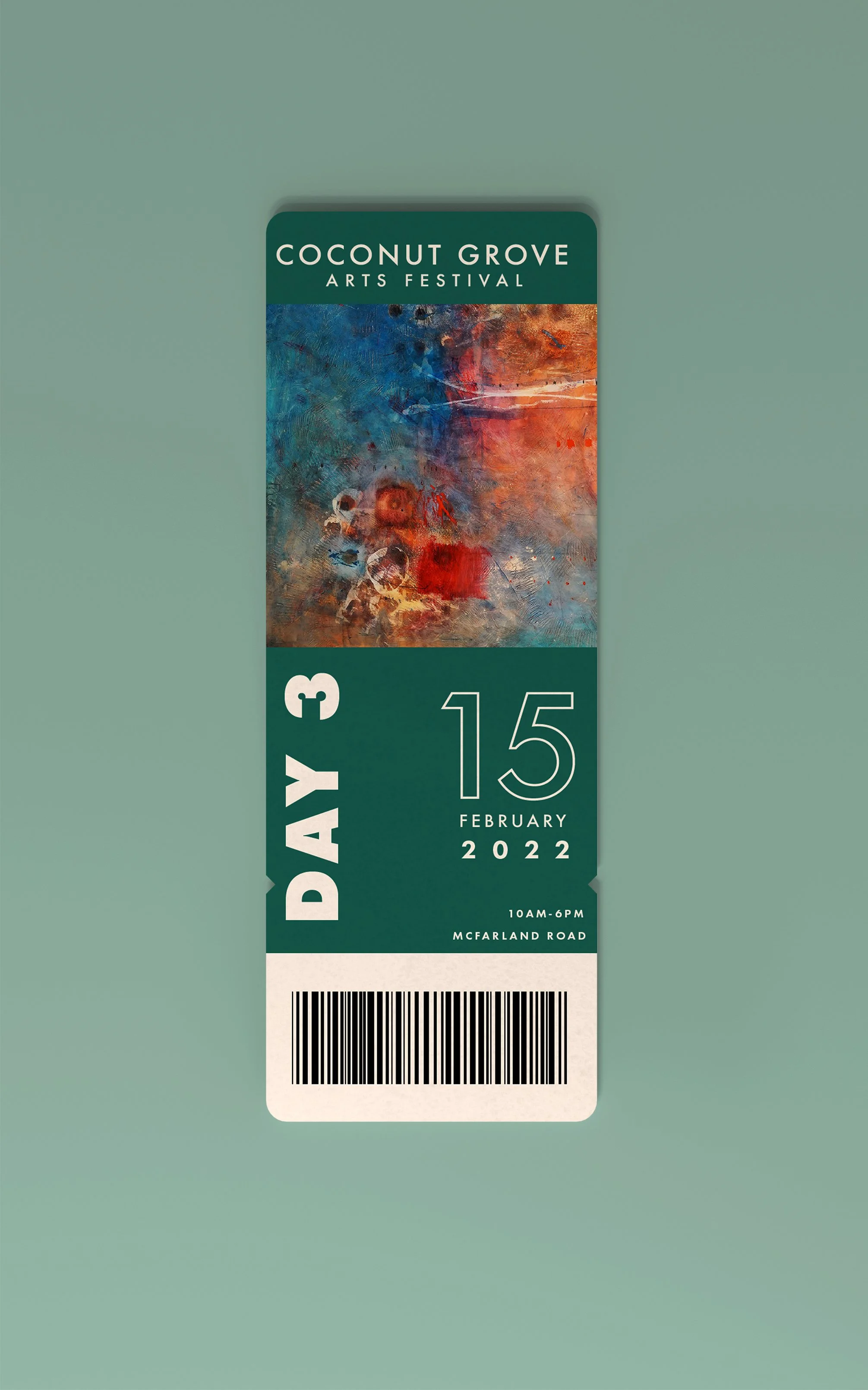
“A Window in” Panels
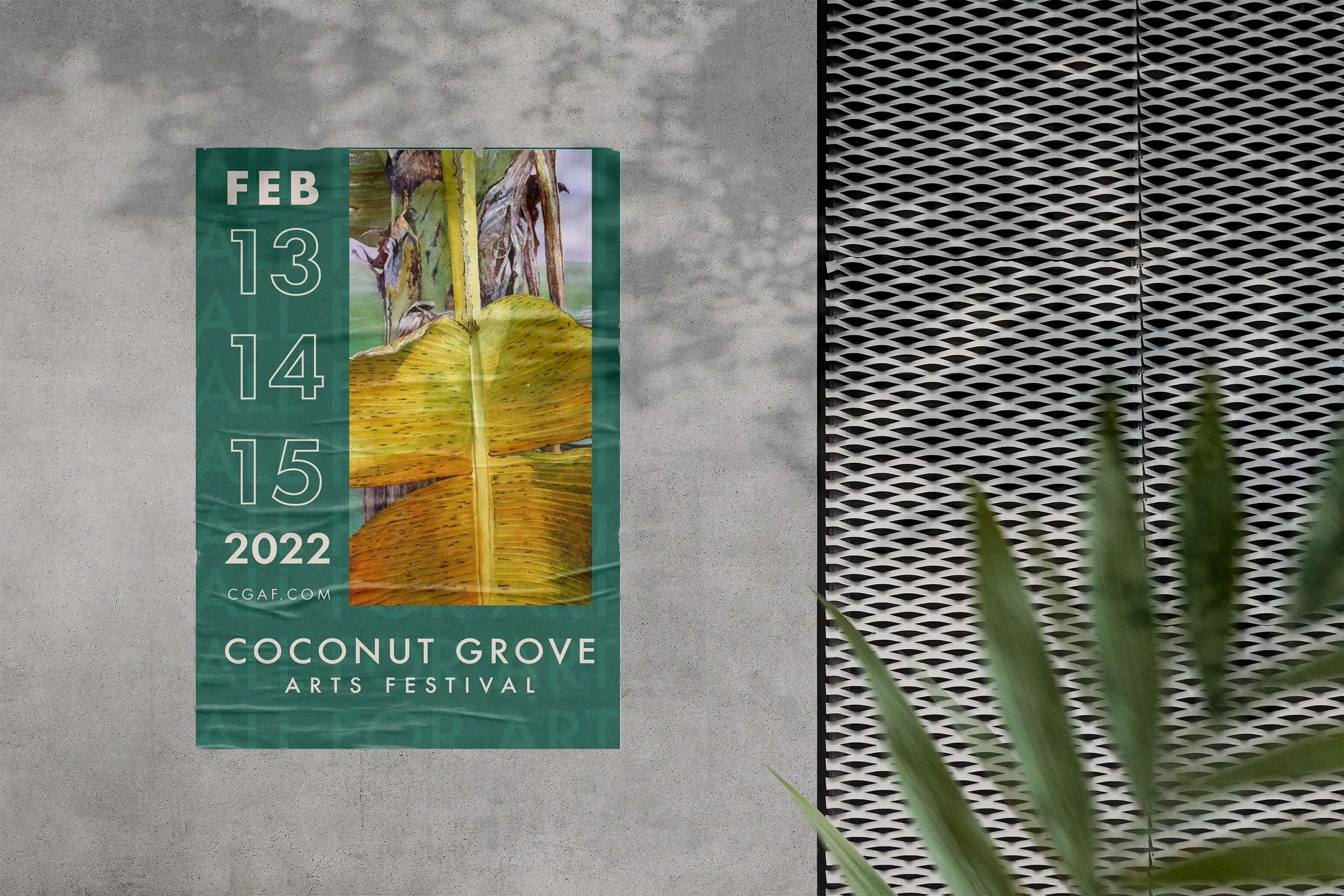
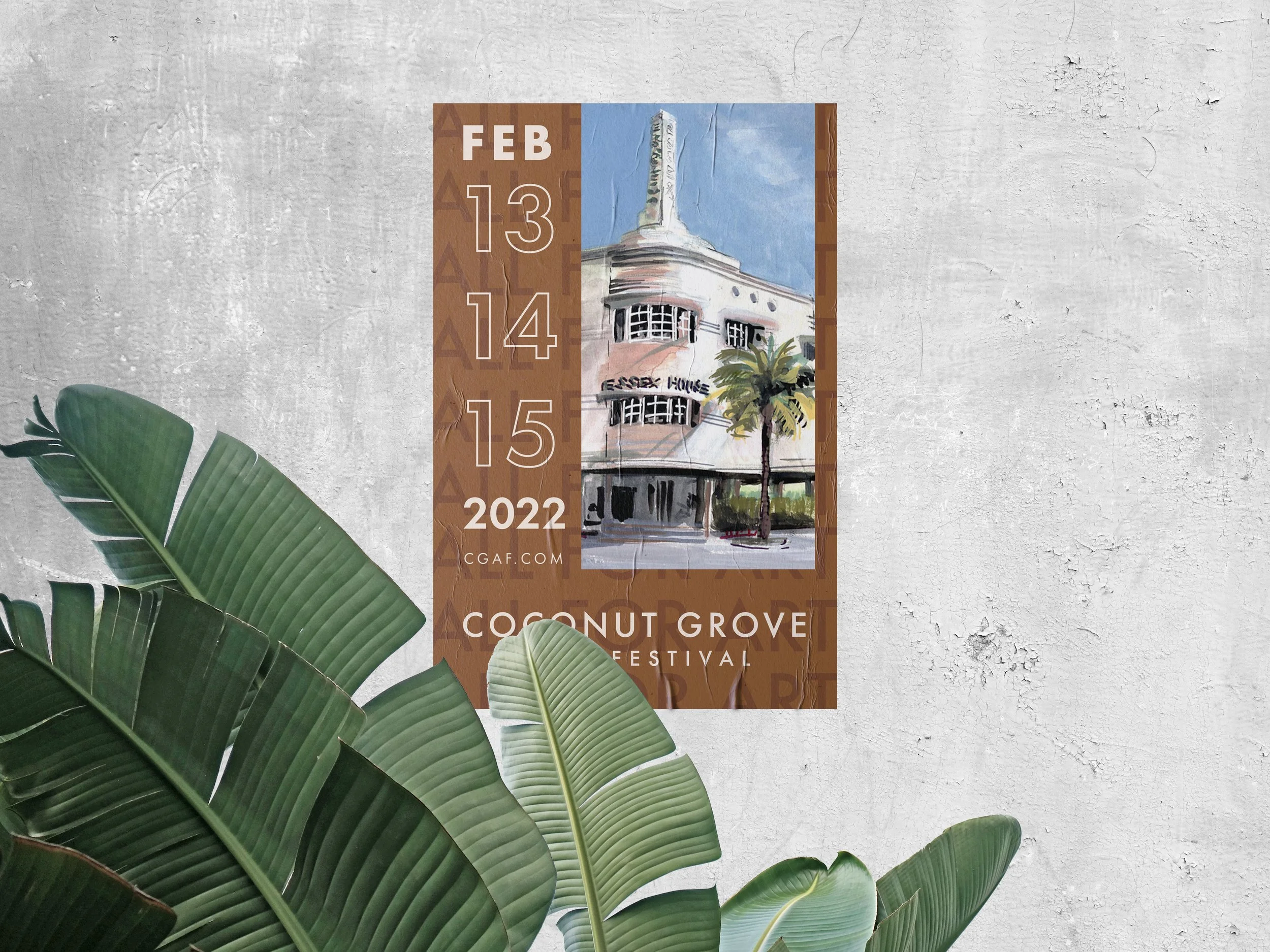
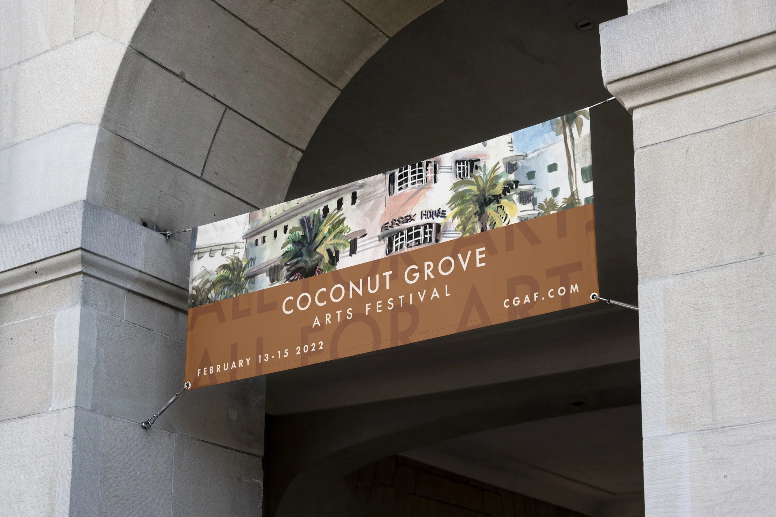
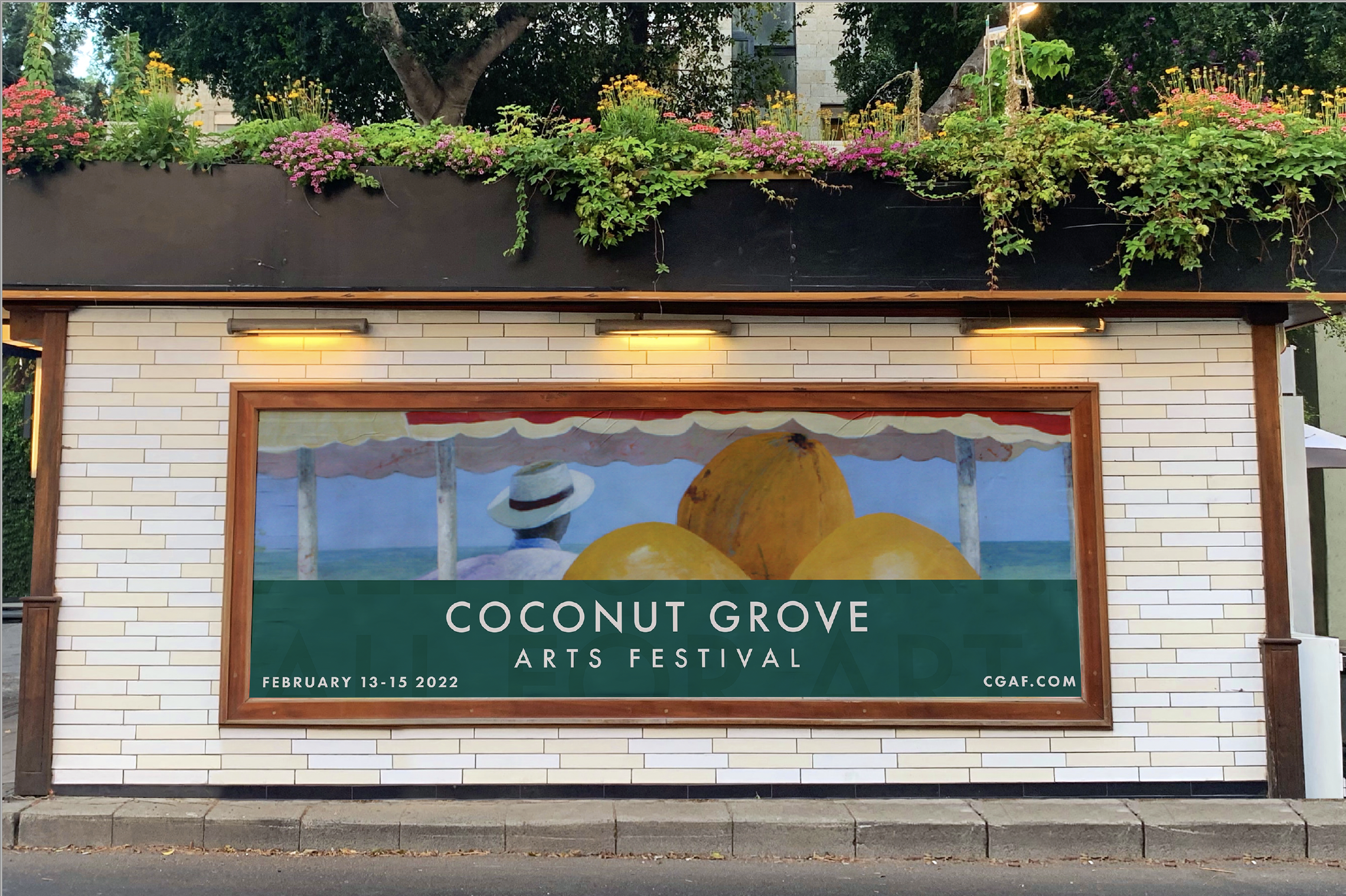
To celebrate the festival’s rich history and their annual poster contest, crowds are able to walk in to some of the winning posters throughout the years.
-
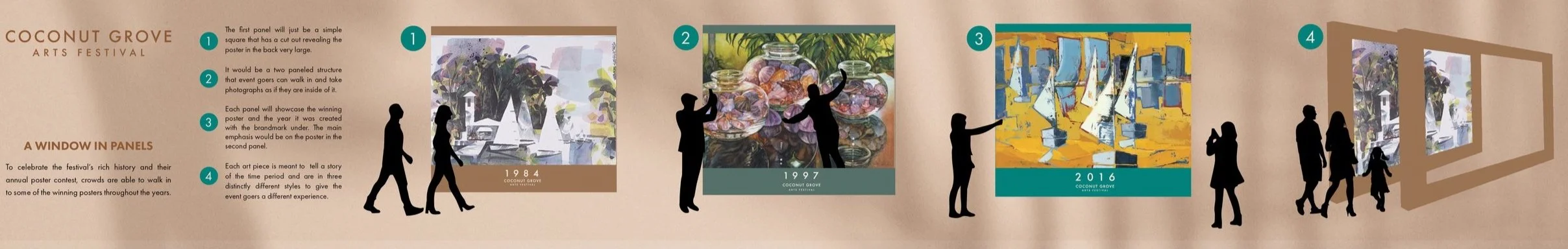
The first panel will just be a simple square that has a cut out revealing the poster in the back very large.
-
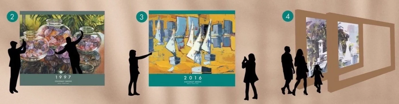
It would be a two paneled structure that event goers can walk in and take photographs as if they are inside of it.
-
Each panel will showcase the winning poster and the year it was created with the brandmark under.
The main emphasis would be on the poster in the second panel.
-
Each art piece is meant to tell a story of the time period and are in three distinctly different styles to give the event goers a different experience.